Land-surface temperature
Hotter land often points toward drier conditions, especially where vegetation is sparse.

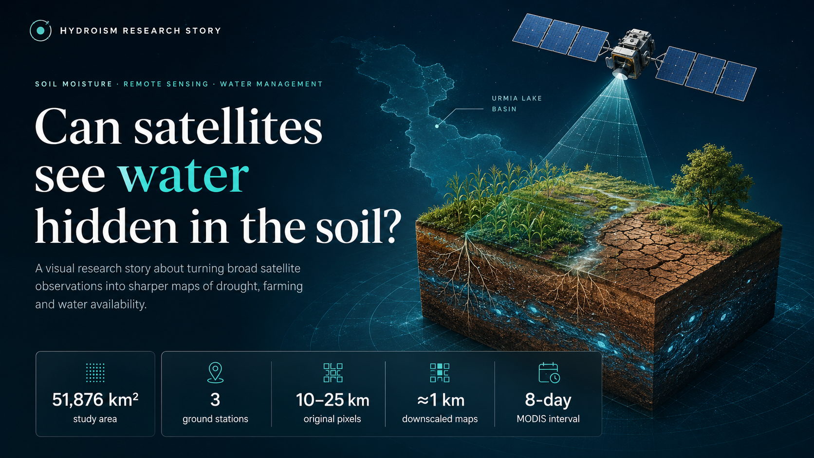
A few sensors cannot describe an entire watershed. This research asked whether heat, vegetation, and satellite observations could reveal a sharper picture of where the land is wet—and where it is drying.
Begin the story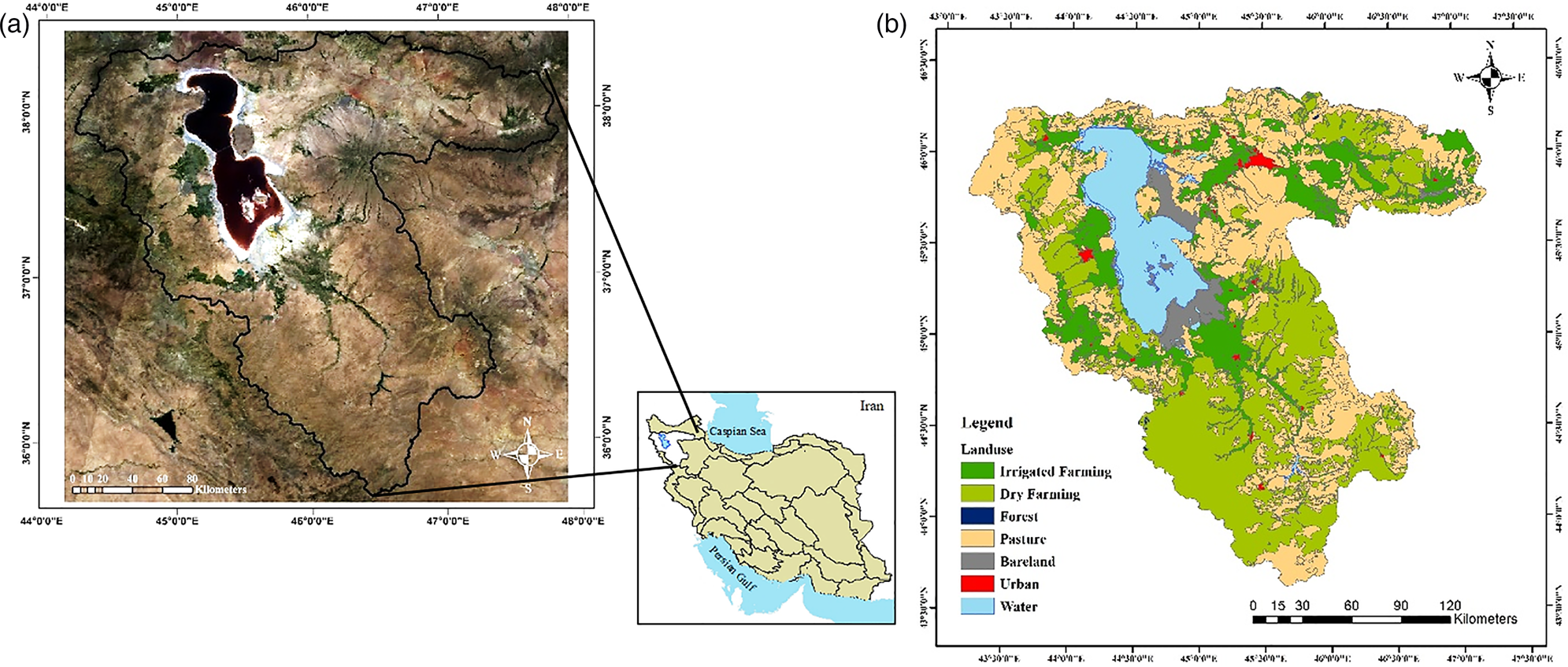
The blurry satellite view
A basin inside a pixel
Microwave satellite and model products can estimate soil moisture over enormous regions. Their weakness is detail: one pixel may be 10 to 25 kilometres wide.
Inside that one block may be farms, bare land, mountains, roads, settlements, and water. The regional average is useful, but it is too coarse for many agricultural and basin decisions.
The landscape clues
Heat · Vegetation · Moisture
Dry ground usually becomes hotter. Wet soil often remains cooler because energy is used to evaporate water.
Vegetation provides a second clue. Healthy plants alter both surface temperature and reflectance, helping distinguish bare soil, partial cover, and dense vegetation.
Hotter land often points toward drier conditions, especially where vegetation is sparse.
Greenness helps separate bare soil, partial cover, and dense vegetation across the basin.
The Temperature Vegetation Dryness Index positions each pixel between estimated wet and dry edges.
The heat and vegetation clues suggest neither an extremely dry nor an extremely wet surface.
Sharpening the picture
The UCLA method
The large satellite pixel supplied the overall moisture signal. Local heat and vegetation patterns suggested how that moisture should vary inside it.
The result was a set of maps with an approximate spatial resolution of 1 km—much sharper than the original 10–25 km products.
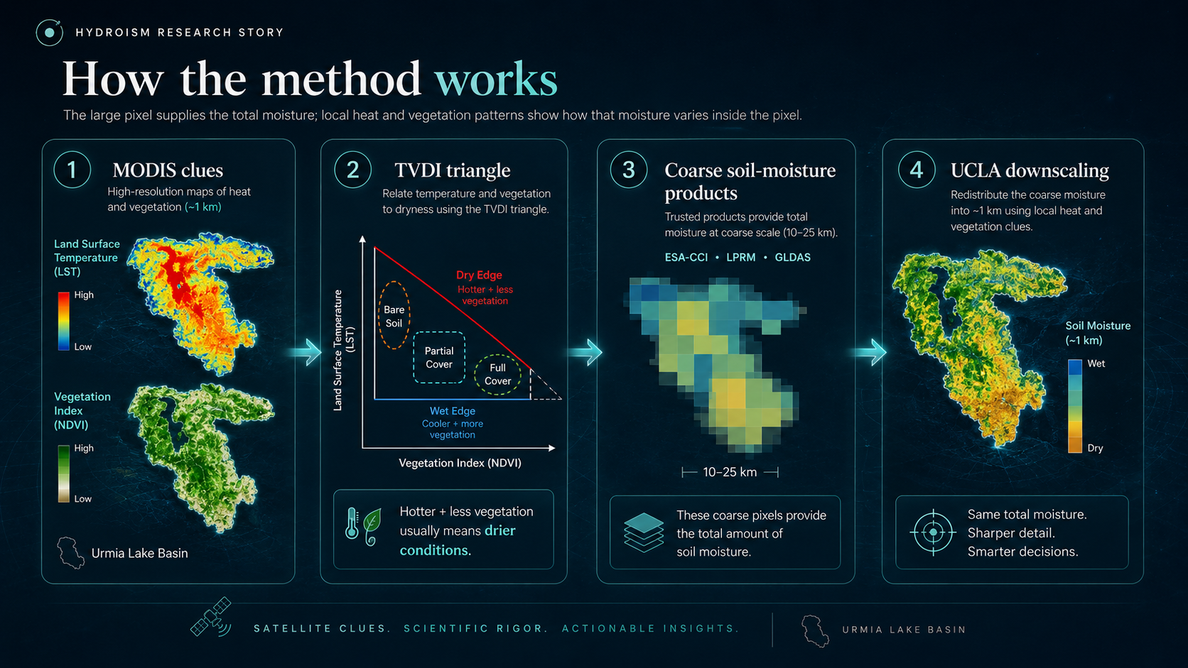
Collect soil-moisture products with pixels around 10–25 km wide.
Use MODIS to map surface temperature and vegetation every eight days.
Combine heat and vegetation into the Temperature Vegetation Dryness Index.
Redistribute the broad signal into a sharper map at approximately 1 km resolution.
A basin through the seasons
2010 · 2014
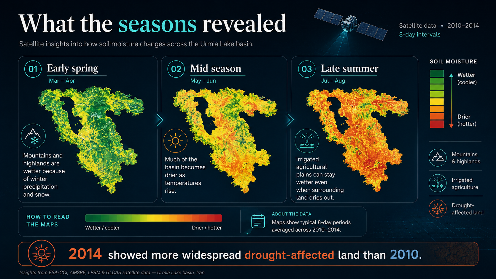
Moisture did not simply rise or fall everywhere at once. Every land use followed its own seasonal story.
Highlands began wetter, much of the basin dried as temperatures rose, and irrigated agricultural plains could stay wetter later into summer.
Seasonal reading
Mountains and elevated areas held more surface moisture because of winter precipitation and snow cover.
The reality check
Satellite vs ground
The downscaled estimates were compared with soil-moisture observations measured at approximately 5 cm depth.
The comparison used three available ground stations and evaluated correlation together with several error statistics.
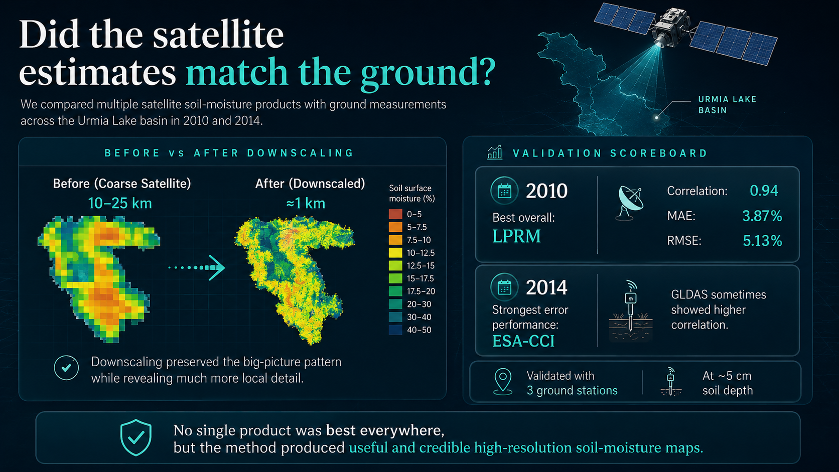
At the Tabriz University research farm, LPRM had the strongest overall combination of correlation and error statistics.
Across the two validation stations, ESA-CCI produced the strongest overall error performance, although GLDAS sometimes showed higher correlation.
No single product was best everywhere and in every year. Performance depended on the sensor, model, land cover, and available ground observations. The research supports careful use—not blind trust.
Why it matters
From map to decision
The method does not create water or replace field instruments. It helps reveal where attention, measurement, and management may be needed most.
Identify areas showing water stress and compare conditions across agricultural land.
Track where dry conditions are expanding and how different land uses respond.
Improve understanding of how much rainfall may infiltrate or become surface runoff.
Decide where new monitoring stations and ground investigations may add the most value.
See basin-scale patterns without losing the local variations that shape decisions.
Target future measurements toward places where satellite products disagree or uncertainty is high.
Keeping the story honest
What the maps cannot see
Remote sensing expands our view, but it remains an estimate of near-surface conditions—not a perfect measurement of every root zone and field.
The method is best treated as a powerful complement to field monitoring, never a replacement for it.
Validation focused on observations around 5 cm depth. Deeper root-zone moisture may behave differently.
Only three stations were available. A denser network would provide a stronger and more representative test.
About 1 km is a major improvement over 10–25 km, but one mapped cell can still contain several fields and land-cover types.
Optional technical layer
NDVI is a vegetation index derived from red and near-infrared reflectance. LST is land-surface temperature derived from thermal observations. TVDI positions each pixel between estimated wet and dry edges in LST–vegetation space.
The study evaluated ESA-CCI, LPRM, AMSR-E/AMSR2, and GLDAS products, depending on data availability in 2010 and 2014. Their original spatial resolution was typically about 10 or 25 km.
The method used the ratio between MODIS-scale TVDI and the average TVDI within each coarse product pixel as a spatial scaling factor. In simple terms, the broad soil-moisture value was redistributed using local wetness and dryness patterns while preserving the larger-scale signal.
Ground observations were compared with the estimates using correlation, mean bias error, mean absolute error, root mean square error, centred RMSE, and model efficiency. Full values appear in Table 5 of the published paper.
Water Supply · Volume 23 · Issue 2
The research behind this story
Most visuals in this story were created specifically for Hydroism. One original figure from the paper is retained for geographic and land-use context.